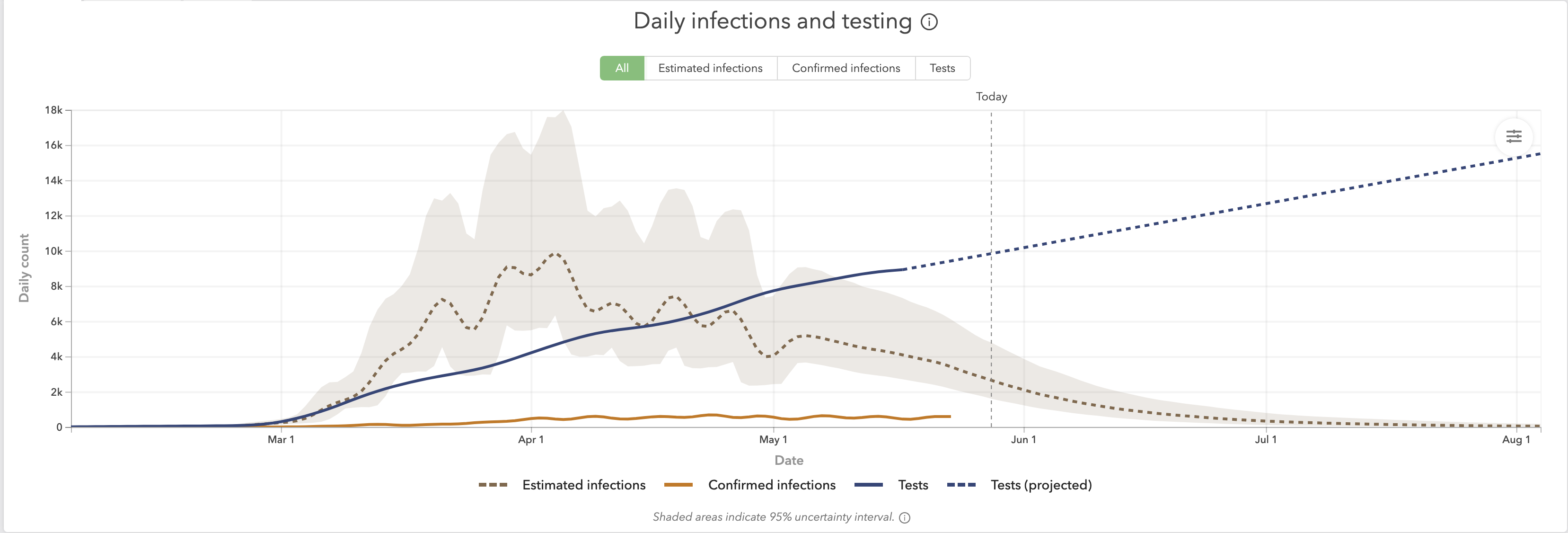
This graph shows just how bad the Covid-19 models were/are.
The top brown dashed line shows the computer model estimates for Swedish infections.
The bottom brown line (yea, all the way at the bottom) shows actual infections.
You can see that the model was off by a factor of 48 times.
Source: https://covid19.healthdata.org/sweden
