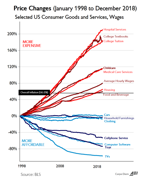
 Of interest: notice that the most regulated part of the economy is the one with skyrocketing prices. What if, what if government got its hands out of the cookie jar?
Based on today’s BLS report for CPI price data through December, I’ve updated the chart above with price changes through 2018. During the most recent 21-year period from January 1998 to December 2018, the CPI for All Items increased by exactly 56.0% and the chart displays the relative price increases over that time period for 14 selected consumer goods and services, and for average hourly earnings (wages). Seven of those goods and services have increased more than average inflation, led by hospital services (+211%), college tuition (+183.8%), and college textbooks (+183.6%). Average wages have also increased more than average inflation since January 1998, by 80.2%, indicating an increase in real wages over the last several decades.
The other seven price series have declined since January 1998, led by TVs (-97%), toys (-74%), software (-68%) and cell phone service (-53%). The CPI series for new cars, household furnishings (furniture, appliances, window coverings, lamps, dishes, etc.) and clothing have remained relatively flat for the last 21 years while average prices have increased by 56% and wages increased 80.2%. Various observations that have been made about the huge divergence in price patterns over the last several decades include:
a. The greater (lower) the degree of government involvement in the provision of a good or service the greater (lower) the price increases (decreases) over time, e.g., hospital and medical costs, college tuition, childcare with both large degrees of government funding/regulation and large price increases vs. software, electronics, toys, cars and clothing with both relatively less government funding/regulation and falling prices. As somebody on Twitter commented:
Blue lines = prices subject to free market forces. Red lines = prices subject to regulatory capture by government. Food and drink is debatable either way. Conclusion: remind me why socialism is so great again.
b. Prices for manufactured goods (cars, clothing, appliances, furniture, electronic goods, toys) have experienced large price declines over time relative to overall inflation, wages, and prices for services (education, medical care, and childcare).
c. The greater the degree of international competition for tradeable goods, the greater the decline in prices over time, e.g., toys, clothing, TVs, appliances, furniture, footwear, etc.
Chart of the day…. or century? | American Enterprise Institute – AEI %
As I wrote last summer on CD, I’ve probably created and posted more than 3,000 graphics on CD, Twitter, and Facebook including charts/graphs, tables, figures, maps and Venn diagrams over the last 12 years. Of all of those graphics, I don’t think any single one has ever gotten more attention, links, re-Tweets, re-posts, and mentions …