
4. What Rising Income Inequality? We hear all the time about “rising income inequality” in America (there are more than 100,000 Google search results for that term), about “the rich getting richer and the poor getting poorer,” the “stagnant or disappearing middle class,” all of the recent income gains going to the rich,” the lack of income mobility and other narratives of pessimism. In a December 2013 speech, President Obama described rising income inequality as the “defining challenge of our time” and promised that for the rest of his presidency, he and his administration would focus all of their efforts to stop the increase in income inequality. And yet, the data in today’s Census Bureau tell a much different story.
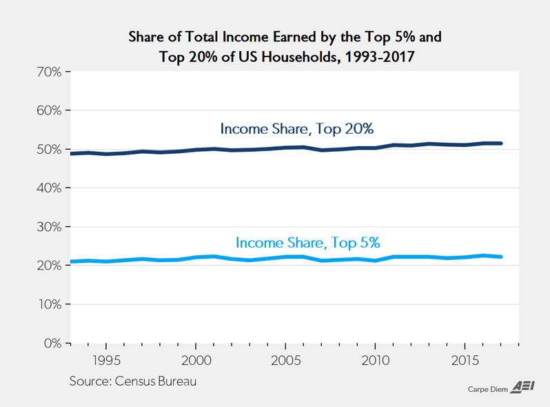
a. The top chart above shows the shares of total income earned by the top 20% and top 5% of US households from 1993 to 2017. In 1993, 48.9% of total income went to the top quintile of US households, and 24 years later in 2017, the share of income going to the top 20% of households has increased to only 51.5%. Likewise, in 1993 the share of total income going to the top 5% of US households was 21.0%, and that share had increased to only 22.3% last year. Interestingly, the 22.3% share of income earned by the top 5% of households last year was lower than the share that group earned in 2016 (22.6%) and 2001 (22.4%), and the same as in 2006, 2011 and 2012. Over the last two decades, the income shares of the top 20% and top 5% have been remarkably stable at about 49-51.5% and 21-22.6% respectively, and there has been no statistical evidence of significant “rising income inequality” according to these measures.
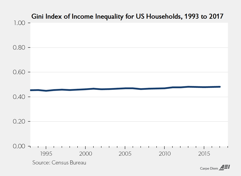
b. The bottom chart above shows the annual Gini index of income inequality (a statistical measure of income dispersion that quantifies income inequality on a range from 0.0 for complete equality to 1.0 for complete inequality) for US households from 1993 to 2017. Like the first two measures above, the Gini index measure of income dispersion reveals that there has been no significant trend of “rising income inequality” for US household incomes over the last quarter century. The Gini index in 1993 was 0.454 and last year it was 0.482, the same as in 2013, and this statistical measure of income inequality has also shown remarkable stability for the last several decades in a narrow range between 0.46 and 0.48.
Whether we look at Census Bureau data on the share of total income going to the top fifth and top 5% of American households, or Census data on Gini coefficients for US household income, there is very little statistical support for the commonly held view by the public, academia, and the mainstream media that income inequality has been rising in recent years or decades. A more accurate description of income inequality over the last several decades in the US would be to say that it has been remarkably stable for the last 25 years starting about 1993.
So why are we having a national debate about solutions to the “non-problem” of rising income inequality that doesn’t even exist according to several standard Census Bureau measures? Maybe it’s another example of what H.L. Mencken called an “imaginary hobgoblin”:
The whole aim of practical politics is to keep the populace alarmed (and hence clamorous to be led to safety) by menacing it with an endless series of hobgoblins, all of them imaginary.
Via MJP